Design Award and Recognition

Communication Arts 2023
Annual Award Winner - Design Excellence

2024 Interaction Awards
Shortlist for Disturbing Design Category
Reimagining Ticketmaster
Ticketmaster is the world's largest event ticketing platform. While live events are something people look forward to, the experience of getting tickets often comes with frustration and negative emotions. We recognize that securing high-demand tickets is a systemic challenge, and not one this project aims to solve. Instead, this case study explores how rethinking supporting features and interactions can make the overall experience more intuitive, transparent, and enjoyable, from planning a night out to the moment you arrive at the venue. Our goal: to reduce friction around the moments before and after the purchase, helping users feel more confident, prepared, and excited about their night.
Research
Competitor Analysis

RESEARCH
Affinity Mapping
We asked our interviewees about their frequency to attending a live event, understand their ticketing process and what are some frustration they encounter throughout the process.
RESEARCH
Empathy Interview
We conducted 20 empathy interviews with Ticketmaster users to better understand their booking experiences. Below are some of the insights and recurring sentiments that stood out.
I have to use so many apps to plan my evening.
I have to request for payment on venmo, and sometimes I forget about it
We will have to get on a phone call to discuss which seats to get, or sending screenshots
If it wasn't so social, no body would watch. It's really engrained in social media and pop culture references. It's something to talk about.
Choosing seats is confusing, the map alone doesn't give you a sense of how far the stage is.
I appreciate recommendations, they make choices easier.
RESEARCH
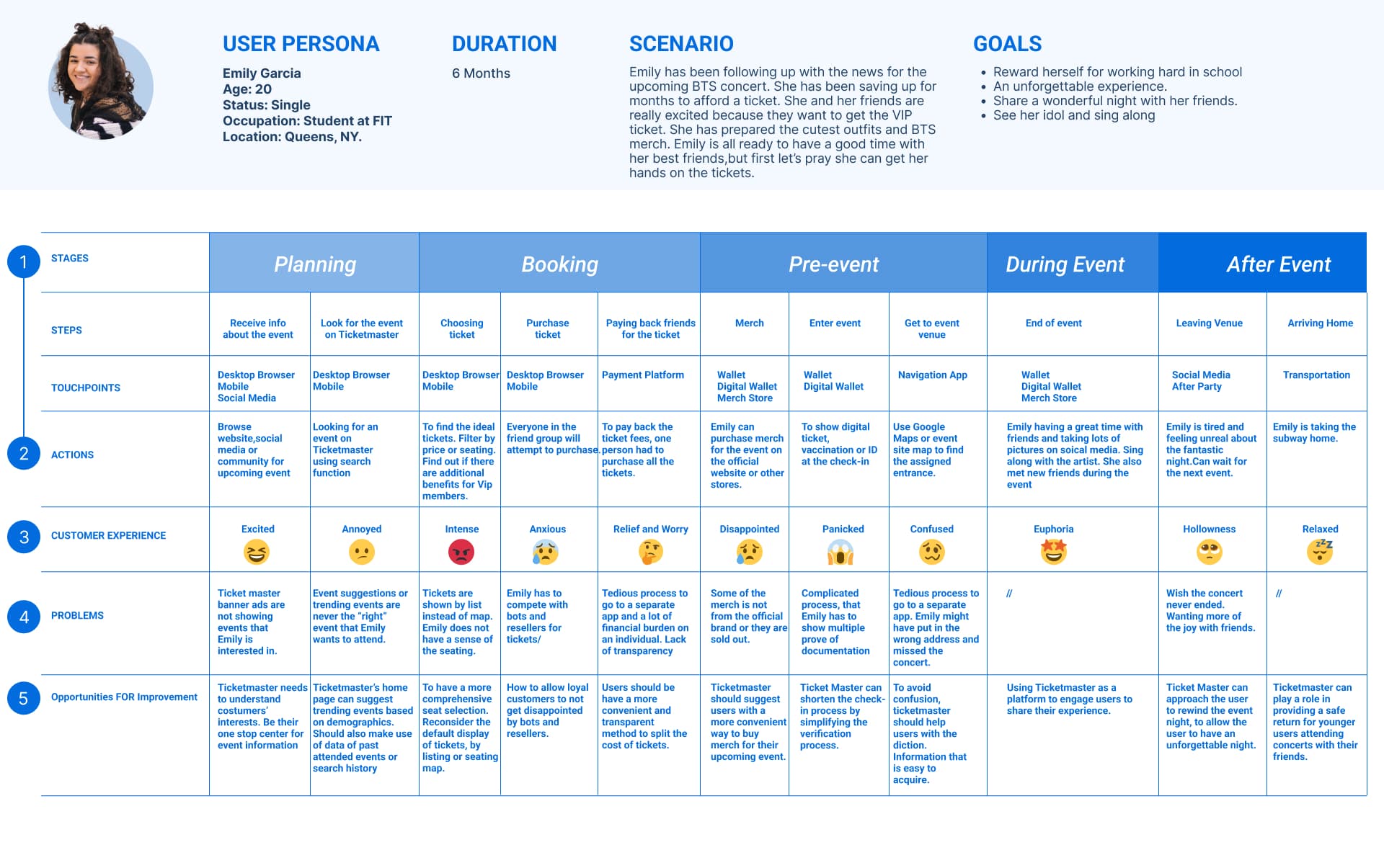
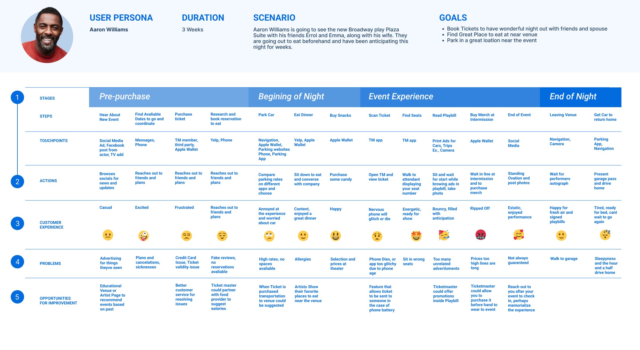
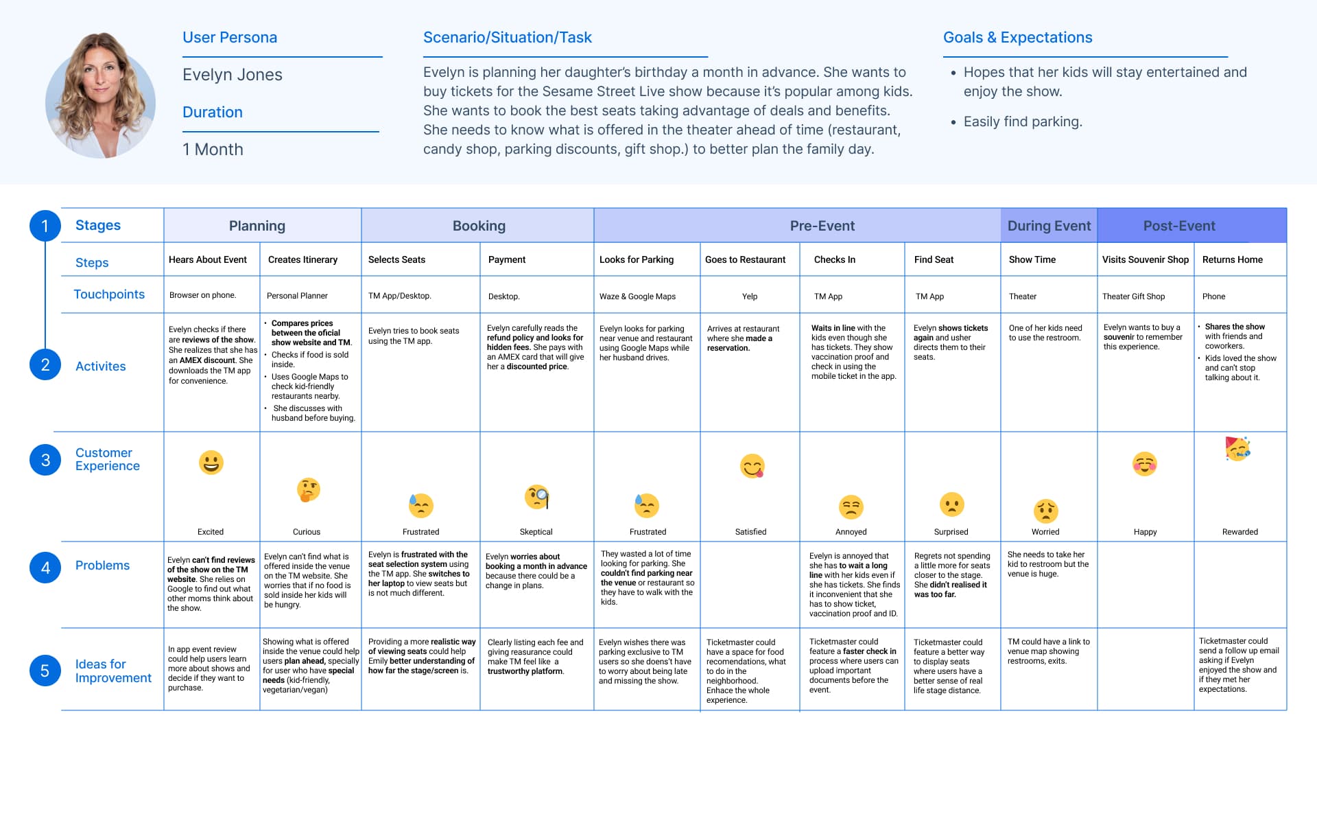
Journey mapping
We developed a comprehensive journey map that traced the user experience from discovering an event to completing the ticket purchase, attending the event, and post-event reflection. This allowed us to identify key workflows, emotional highs and lows, friction points, and breakdowns across the end-to-end experience.

DEFINE
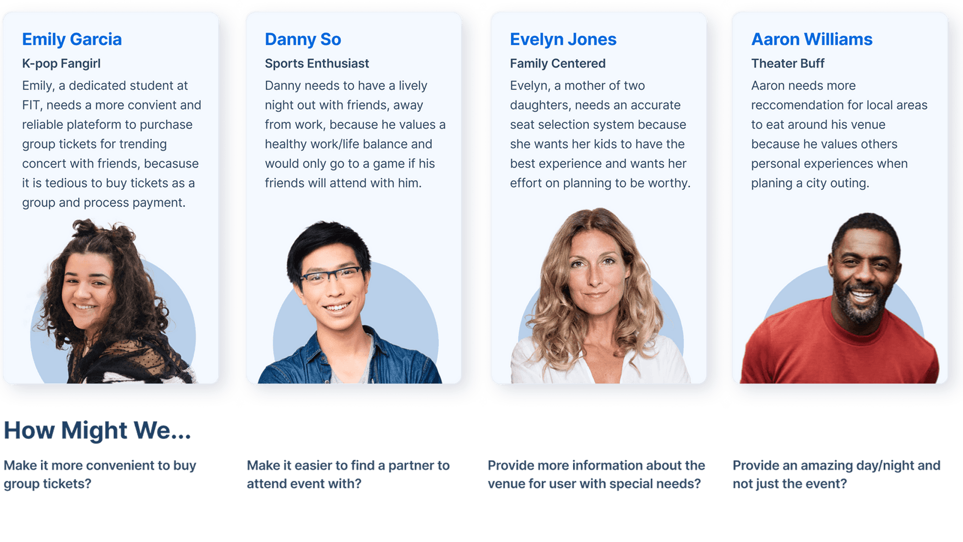
Problem framing
Based on our research findings, we identified key problem areas across the user journey. From these insights, we developed targeted problem statements and user personas to clearly define user needs and pain points.
DEFINE
MVP
After collaborative discussions and prioritization workshops, we defined a focused set of MVP features that we believe will deliver the greatest value to our target personas. From there, we explored how each core idea could evolve beyond the MVP — expanding from essential table-stake functionality to differentiated features that create long-term competitive advantage.

IDEATE
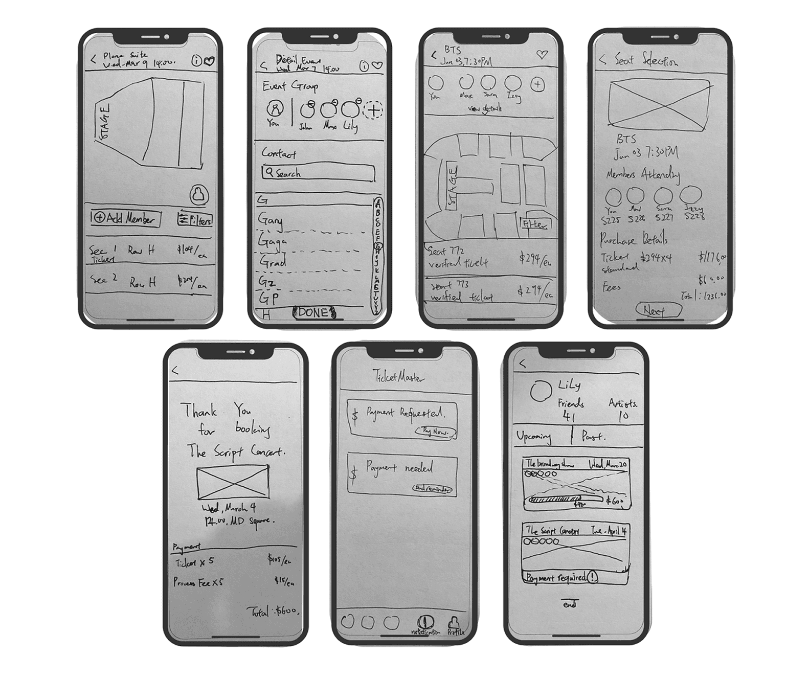
Wireframe Sketches
We developed wireframes to visualize product task flows and layout structure. These low-fidelity sketches helped clarify core interactions, validate assumptions, and align design with user needs before high-fidelity exploration.
IDEATE
Task Flow
We created Task Flows to map out the exact steps a user needs to take to achieve their goals. By visualizing this journey early on, we were able to identify potential friction points and ensure the logic of the application was as streamlined and intuitive as possible before moving into design.
IDEATE
Low-Fidelity Wireframes
Once the flow was established, we moved into Low-Fidelity Wireframes. We used these skeletal blueprints to focus purely on layout, content hierarchy, and functionality. By keeping things simple and avoiding the distraction of colors or branding, we were able to iterate quickly and validate our core ideas through early testing.
EVALUATION
Testing, Feedback, and Iteration
During our initial usability testing, we discovered a significant point of friction: users felt overwhelmed when 'Split Pay' was introduced at the final payment screen. Introducing a complex social coordination task at the end of the funnel led to cart abandonment and user confusion. To solve this, I conducted competitive auditing of successful apps like Uber Eats. I observed that high-performing platforms initiate 'Group Ordering' at the very beginning of the flow. Based on this insight, we iterated on our architecture to move the group logic to the start of the journey. This shift ensured that by the time the user reached the checkout, the logistics were already settled, resulting in a much smoother, stress-free conversion path.
EVALUATION
Final Delivery
For our final delivery, we designed four core functions specifically engineered to enhance the end-to-end user journey—transforming the experience from simple ticket ordering into comprehensive event planning. We believe these solutions leverage Ticketmaster's inherent brand strengths while creating tangible value for the user. By addressing pain points like group coordination and planning early in the flow, we've positioned the platform not just as a transactional tool, but as a caring and trusted partner that supports the user through every stage of their live event experience.

Social Profile
Expanding the traditional account into a social layer, Social Profile allows users to share upcoming event plans with friends they already know. By making event activity visible, it opens the door to spontaneous plans: friends joining last minute, discovering shared interests, or bonding over artists, teams, or shows you didn't realize you had in common. The result is a more connected experience that turns ticketing into a social catalyst, not just a transaction.
EVALUATION
Design System
We reimagined the Design System by developing a distinct visual code to help users intuitively differentiate between various event types at a glance. Inspired by the dynamic energy of stage lighting, we created a series of custom gradients designed to mimic the unique atmosphere of a live event. This wasn't just an aesthetic choice; by using light and color to evoke the 'feeling' of being in the crowd, we bridged the gap between the digital interface and the physical experience. This cohesive visual language ensures that whether a user is booking a high-energy concert or a theatrical performance, the interface feels like a natural extension of the event itself.
The Final Verdict
What We Did Well
In this project, we successfully shifted Ticketmaster from a transactional site to a holistic event-planning ecosystem. By identifying that most users only visit to buy a ticket and then leave, we found a "plus" for the product: convenience through connection.
- Integrated Discovery: We reimagined the homepage by tailoring content to user needs, proposing integrations with music apps like Spotify and Apple Music to promote exploration of new genres.
- Social Circle Expansion: We moved beyond the solo purchase, making it possible to engage and expand a user's social circle directly within the app experience.
- The "Wholesome" Experience: By removing the need for multiple third-party apps to coordinate group tickets, we positioned Ticketmaster as a caring and trusted partner in the event space.
- Digital Footprints: Recognizing the trend of capturing memories and the rise of NFTs, we explored ways for users to keep a digital "moment" of their experience, making the event truly memorable.
- Strategic Ideation: This project allowed me to find my personal strengths in research and ideation—the process of uncovering "why" users behave the way they do and brainstorming creative ways to bridge those gaps.
What Can Be Improved
As this was a classroom project and my first deep dive into UX and Figma, there are clear areas I would love to expand on in future iterations:
- Field Research & Observation: Because this was a remote/classroom project, I didn't have the chance to visit event spaces in person. In the future, I want to go on "field trips" to conduct contextual inquiry, observing the user journey from the parking lot to the front row to see real-world friction.
- Quantitative Validation: While our qualitative research was deep, I would have liked to conduct A/B testing on different design variations. Gathering quantitative data on how users interact with the new "Split Pay" flow would have added another layer of validation to our designs.
- Technical Refinement: As my second time using Figma, I am eager to continue refining my prototyping skills to create even more high-fidelity interactions that mimic the final product's "stage light" atmosphere.